

Make no mistake; logos represent the face of brands and have a key bearing on how they are perceived by customers.
In the quest to evolve and target new customer segments, however, brands occasionally feel the need to redesign their logos and invest heavily in the creation of new visuals. This represents a difficult balancing act, particularly as brands look to retain their identity and core consumer base at the same time.
Marketers can also be let down by their own judgement, as we have seen numerous instances in which brands have invested in the strangest and most ineffective logo designs in history. Here are some of the most bewildering:
-
The London Olympics 2012 Logo
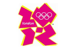

While the London 2012 logo may look as though it was designed by an enthusiastic 10-year old, it actually cost £400,000 and took months of planning and hard work.
The ends certainly does not justify the means in this instance, however, with the logo having failed to impress the masses or convey any sort of clearly defined message. In fact, it has been unfavourably compared to a swastika by some commentators, while Iran even threatened to boycott the Olympics as they believed that the logo appeared to spell out ‘Zion’.
Such confusion and controversy is something that brands strive tirelessly to avoid in most cases, so whichever way you look London’s Olympic logo from 2012 was an epic failure.
-
Medium’s Logo
For every logo design that inspires awe, there is a redesign that makes you question the thinking that drives individual marketing departments and the decisions that they take.
We cannot figure out exactly why publishing platform Medium decided to change their own familiar logo, for example, as they switched from a iconic, single M in Stag font to a bewildering geometric figures that melds both sharp and rounded edges.
![]()

-
Pepsi’s Logo
Before we look at Pepsi’s exceptionally ill-judged logo redesign, we need to create some context by looking at the estimated costs. While the total rebranding process cost approximately $1.2 billion, the alteration of the brand’s logo alone is thought to have cost upwards of $1 million.
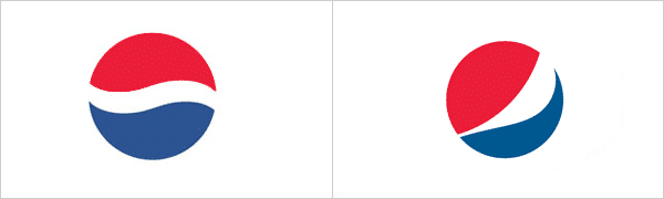

The result was a new logo that people were either turned off by or simply failed to notice in the first place. It certainly did nothing to help the brand, which is constantly forced to compete with the iconic and instantly recognisable identity of Coca Cola.